


by Michelle
Share
by Michelle
Share
")
Are you ready to learn about Custom Themes on Substack? Oooh, exciting! Right?
Last time we chatted about sprucing up your About page. We updated one page, but today we are going to make your publication actually stand out.
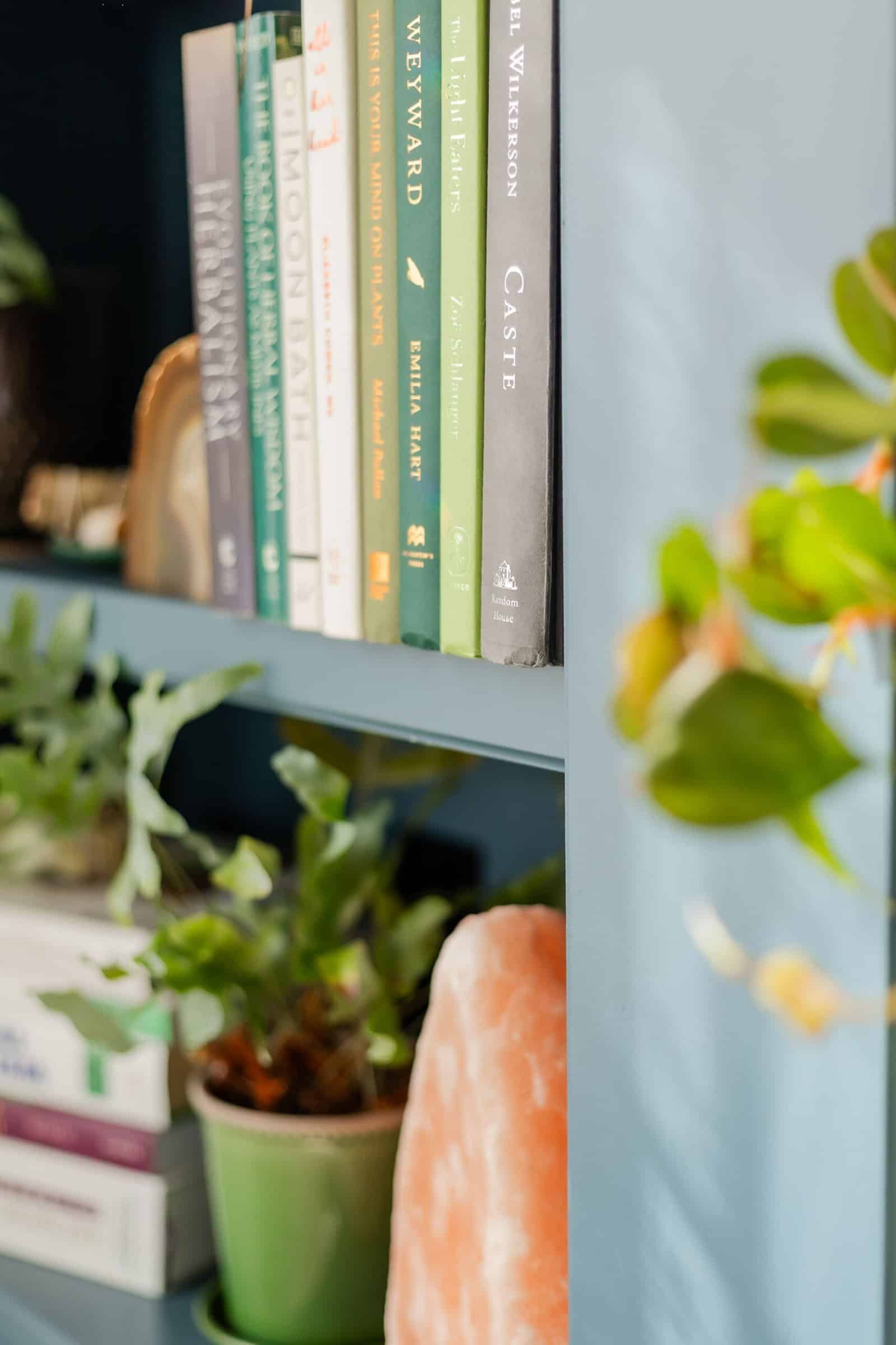
If you invited guests to your home, you’d want it to sparkle and shine. Well, your publication is your digital home so it’s no different. We want it to look the best it can. Let’s take a look!
The Four Pillars of Your Publication’s Look
Your Substack publication has four main customization areas (custom themes):
- Branding (your visual identity)
- Theme (your color palette and typography)
- Homepage (your reader’s first impression)
- Sections (how your content is organized)
I’ll save Sections for another post (gotta leave something for next time, right?), but let’s focus on the first three which will give us plenty to do!
Finding Your Way to the Custom Themes Setting
First things first—how do you even get to these magical customization options?
- Head over to your Dashboard
- Find the Settings link in your navigation bar
- Click on Branding in the sidebar
- Hit that Edit theme button
Booya! You’ve unlocked the Theme Settings portal where the branding magic happens.

Creating Your Visual Identity: Logos Matter
Let’s start with Branding. Click on it to open your options.
The first thing you’ll want to tackle is your logo. This isn’t just any image—it’s how readers will r recognize you. You’ll need:
- A square logo (256×256 pixels) – This little guy shows up on the left side of your dashboard and publication
- A wordmark (1344×256 pixels) – This appears front and center on your publication and dashboard
Both of these images also grace the top of each post, so they’re really your publication’s first impression. No pressure!

Tip: These logos are different from the welcome image that greets new subscribers. To update that one (which should be 600×600 pixels), head back to Settings and check out the Welcome page options.
Not a designer? No big deal. Canva’s free version works perfectly for this. I’ve created templates you can use (these are simple examples that give you the correct sizing – add elements, colors, and text.)
I recommend saving these as PNG files for the best quality.
Colors & Typography: Setting the Mood
Once your logos are uploaded, it’s time to choose your colors and fonts. While Substack doesn’t offer endless options here, you can still create your own look.
For colors, you can either pick from Substack’s palette or enter a specific HEX code. Personally, I use #0876b0 for my branding—a friendly blue that matches my overall vibe. I prefer keeping my background clean and white, but you might want something more colorful. You do you!
Typography options are somewhat limited, but they still make a big difference in how your content feels to readers. Play around with different heading, body, and link styles until you find the combination that best represents your writing voice.
Don’t forget to save your changes before moving on!
Designing Your Substack Homepage
Now click the arrow at the top of the Branding bar to go back to the main options. Let’s explore how to make your Homepage irresistible.
As Substack explains:
“In the Homepage section, you’ll see two sections that compose your homepage: an Intro, which determines the post or posts that appear at the top of your homepage, and a Body, which determines how the remaining posts appear below. Select the toggle next to ‘Advanced layouts’ to format posts into different views such as lists, grid, tags, sections, or featuring recent posts.”
Let’s focus on the Intro section, which controls what appears “above the fold” (what readers see without scrolling). You’ve got several layout options:
- Feature: Shows your recent or pinned posts, perfect for highlighting your Hero post (a pinned post offering a lead magnet for signups)
- Newspaper: Displays three pinned posts and five top posts, giving a classic news feel
- Magazine: Showcases five of your most recent or pinned posts for a visual impact
- Highlight: Features your single most recent or pinned post prominently, with three recent posts on the side
- Media Feature: Puts your most recent post and headline front and center
- Podcast: For the audio creators, showcasing episodes and optional links to external podcast players
The Power of Pinning
Many of these layouts use pinned posts, which brings us to an important question—how do you pin a post?

Simple! Find the post you want to feature, click the three dots next to “Share,” and select Pin to Homepage. This keeps your most important content visible to new visitors, no matter when it was published.
Tip: To exclude posts from the Most Popular section, select “Hide from Top Posts” in the three-dot menu of an individual post.
Below the Fold: The Body of Your Homepage
Now let’s talk about what happens “below the fold,” or as I like to call it, “the stuff people will see if they don’t find you annoying.”
Substack Posts View Options
You’ve got three main ways to display your posts:
- List view – For those who prefer a nice, orderly world where everything is in a tidy row. Marie Kondo would approve.
- Grid view – For the visual thinkers who believe text should be arranged in pretty boxes. Think: Instagram.
- Groups view – The overachiever option. You’ll need to use tags or sections for this one. It shows a grid of posts from specific tags or sections.
To set up the Groups view (and impress all your writer friends), head to the Themes editor and select “Groups (sections or tags)” in the Posts drop-down menu. Then pick which tag(s) or section(s) you want to showcase. Your chosen categories will appear alongside recent posts below the fold. It’s like having little neighborhoods in your content town.
You can mix and match tags and sections like you’re creating a content cocktail. Each tag or section will cozy up before the “Recent Posts” row.

Advanced Layouts in Custom Themes
If you’re feeling particularly brave (or just had an extra cup of coffee), slide the toggle next to “Advanced layouts” to unlock even more options. It’s like finding the secret level in a video game, except with less lava and more content blocks.
Who Benefits from Advanced Layouts?
While anyone can use these fancy options, they’re particularly helpful if you’re building a publication with paid subscribers in mind. Why? The multiple content blocks let you strategically showcase your premium content, create a more professional look that justifies your pricing, and place subscription prompts in high-visibility spots. You can also use the Groups view to clearly separate your free and paid content categories, helping readers understand exactly what they’ll get when they hit that subscribe button.
That said, even if you’re running a completely free publication, these advanced layouts are still worth exploring. They’ll help you organize your content better, highlight your most important posts, and create a distinct visual identity that keeps readers coming back.
You can add content blocks below your Hero section:
- List – For the minimalists
- Grid – For the visually inclined
- Feature – For highlighting that post you spent way too much time on
- Subscribe – For when you’re not being subtle about wanting more subscribers
You can add up to 10 content blocks and mix-and-match them. You can play around with what you like best.
Using Columns
Choose List or Grid, and you’ll unlock the option to add left or right columns. Fill these with:
- Contributors – Show off posts from your publication’s “public” contributors. Great for making your solo publication look more collaborative.
- Links – This is where you remind everyone you’re not just a Substack writer. List your books, social media accounts, or other noteworthy sites.
- Podcasts – For when your written words weren’t enough and you needed to talk, too.
- Recommendations – Where you showcase other Substacks you love. It’s like telling your readers, “If you think I’m good, check out these people who are probably better.”
- Subscribe – Another chance to subtly ask for subscribers.
Substack Custom Themes
Experiment with different layouts for the custom themes to see which one best showcases your unique content. Since your homepage is often a reader’s first impression of your work, make sure it stands out, or at least is user-friendly.
Next time, we’ll dive into Sections and how they can help organize your publication.
Tell the Trees is supported by its readers. When you make a purchase using links on this site, it may result in affiliate commission. Please visit my affiliate disclosure page for more information.
Let's Discuss It

Accessibility isn’t just nice to have; in fact, it’s now more important than ever. In 2025, over 1.3 billion people worldwide live with some form of disability, and many use e-readers or screen readers to access digital content. Yet most self-published authors continue to create ebooks that unintentionally exclude these readers. Microsoft Word, a tool

After my post about the European Accessibility Act, I got some fantastic questions from you that made me realize we need to have a more practical conversation especially regarding digital products. My original post focused on what’s been published — either written by lawyers for lawyers or aimed at big publishers with compliance departments. But what
One of the most often missed topics when it comes to writing and your office workspace is productivity. As a writer, you are focused on drafting, editing, book covers, ARC Reviews, and other important self-publishing topics, we forget that there are more efficient ways to do things. In your office or writing space, you might

The biggest threat for authors on Substack isn't competition or algorithm changes. It's something far more basic: the platform itself. Let's learn more.


