


by Michelle
Share
by Michelle
Share

Accessibility isn’t just nice to have; in fact, it’s now more important than ever.
In 2025, over 1.3 billion people worldwide live with some form of disability, and many use e-readers or screen readers to access digital content. Yet most self-published authors continue to create ebooks that unintentionally exclude these readers.
Microsoft Word, a tool most of us already know, has all the features needed to create truly accessible ebooks. You don’t need expensive software or coding knowledge. The challenge isn’t technical complexity; rather, it’s knowing which settings matter and how to implement them correctly.
Jump to Preferred Section
- What makes a book accessible?
- Why Accessibility Matters For Authors
- Getting Your Word Document Right
- Set Up Your Document
- Master Your Styles
- Font Choices
- Alt Text That Actually Helps
- Color Choices That Work for Everyone
- Table of Contents Set Up & Maintenance
- Accessibility Checker
- Problems to Watch Out for When Formatting
- What’s Next?
- Final Thoughts
- TL;DR
What exactly makes an ebook “accessible”?
Put simply, an accessible ebook has content that works for everyone, regardless of how they interact with text. This includes people using screen readers, those who need high contrast or larger fonts, and readers with cognitive challenges who benefit from clear navigation.
In all honesty, I’m bumping up the text size these days with having to use reading glasses. If you are over the age of 45, you know what I’m talking about. Better layouts help everyone.
This guide breaks down the exact steps to transform your Word documents into accessible ebooks. You’ll learn how to structure content for screen readers, add proper image descriptions, create navigable headings, and use the accessibility checker right inside of Microsoft Word.
If you’re worried this might be over your head, take a deep breath — it’s simpler than it seems. You don’t need special skills or tools. With the right approach, it quickly becomes second nature.
Why Accessibility Matters For Authors
By making your book accessible, you’re not narrowing your audience — you’re expanding it. And frankly, with regulations tightening up, you might not have a choice much longer anyway.
And everyone benefits from well-formatted books. That’s a give in.

Getting Your Word Document Right
Microsoft Word offers powerful built-in tools that make it an excellent choice for creating ebooks that work well for all readers, including those with disabilities. The software includes features like heading styles, alt text options, and an accessibility checker that help ensure your content can be accessed by everyone.
Set Up Your Document
Starting your ebook with the right document setup is critical for accessibility. When you open Word, select a blank document and immediately save it with a clear, descriptive name. This helps you maintain organization and makes it easier for anyone reviewing your document to understand its purpose.
Next, go to the “File” tab, select “Options,” then “General,” and ensure your name and other document properties are filled in. These properties help screen readers identify the document correctly. While in the Options menu, check the “Save” section and make sure “Save files in this format” is set to the latest .docx format for best compatibility with accessibility features.
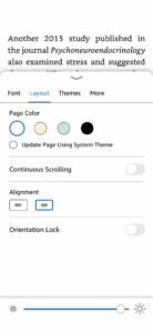
For margins and page setup, go to “Layout” > “Margins” and select “Normal” (1-inch margins all around) or “Moderate” as these provide good readability. Avoid very narrow margins as they can make text difficult to read, especially on smaller screens or for people with vision impairments. Also, set your line spacing to at least 1.15 or 1.5 for better readability—find this under “Paragraph” settings in the Home tab.
Watch the video above for a detailed walkthrough, but here’s your accessibility checklist:
1. Master Your Styles (Seriously, this is everything)
If you take away one thing from this post, let it be this: use Word’s built-in styles for everything. I mean everything. Your chapter headings, body text, bullet points, captions—the works.
Why does it matter? When you convert your Word doc to an EPUB, those styles become the backbone of your ebook’s navigation. Screen readers use them to help people jump between sections, and ebook readers use them to generate tables of contents automatically. In the accessibility world, these are called navigation aids because they provide structure for ereaders and assistive technology.
When you use heading styles, it helps set up your Table of Contents too. And those headings help with metadata which is how your book will be found on places like Amazon.
Maintain a logical hierarchy—never skip levels (like going from Heading 1 directly to Heading 3)
Quick Style Setup:
- Chapter headings: Use “Heading 1” or create a custom “Chapter Heading” style
- Body text: Stick with “Normal”
- Lists: Create specific styles for bullets and numbered lists
- Captions: Make a dedicated caption style
Pro tip: If you’re not sure how to create custom styles in Word, just select some text that’s formatted how you want it, then right-click in the Styles gallery and choose “Create a Style.” Word will remember all your formatting choices.
A Word About Font Choices
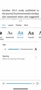
If you end up creating a new style, use fonts that are readable. Not all fonts can be read on ereaders, so it’s good to stick with standard fonts like Arial, Times New Romans, Calibri, Verdana, or Georgia. Even if you select a font choice, the reader is able to adjust the fonts using the ereader options. It’s best to use one font in your ebook.
Amazon KDP and Kindle use specific fonts for their ecosystem. For instance, Bookerly or Amazon Ember. Both are clean and easy to read. Using custom fonts in an ebook is a waste of time as readers can override your font choices and fancy fonts get converted into strange characters and symbols. Make it easy on yourself and use a standard font that reads well.
Interestingly, folks with dyslexia prefer the comic sans font. Many people struggling with dyslexia get the “b” and “d” mixed up, but comic sans is easier for them to read.
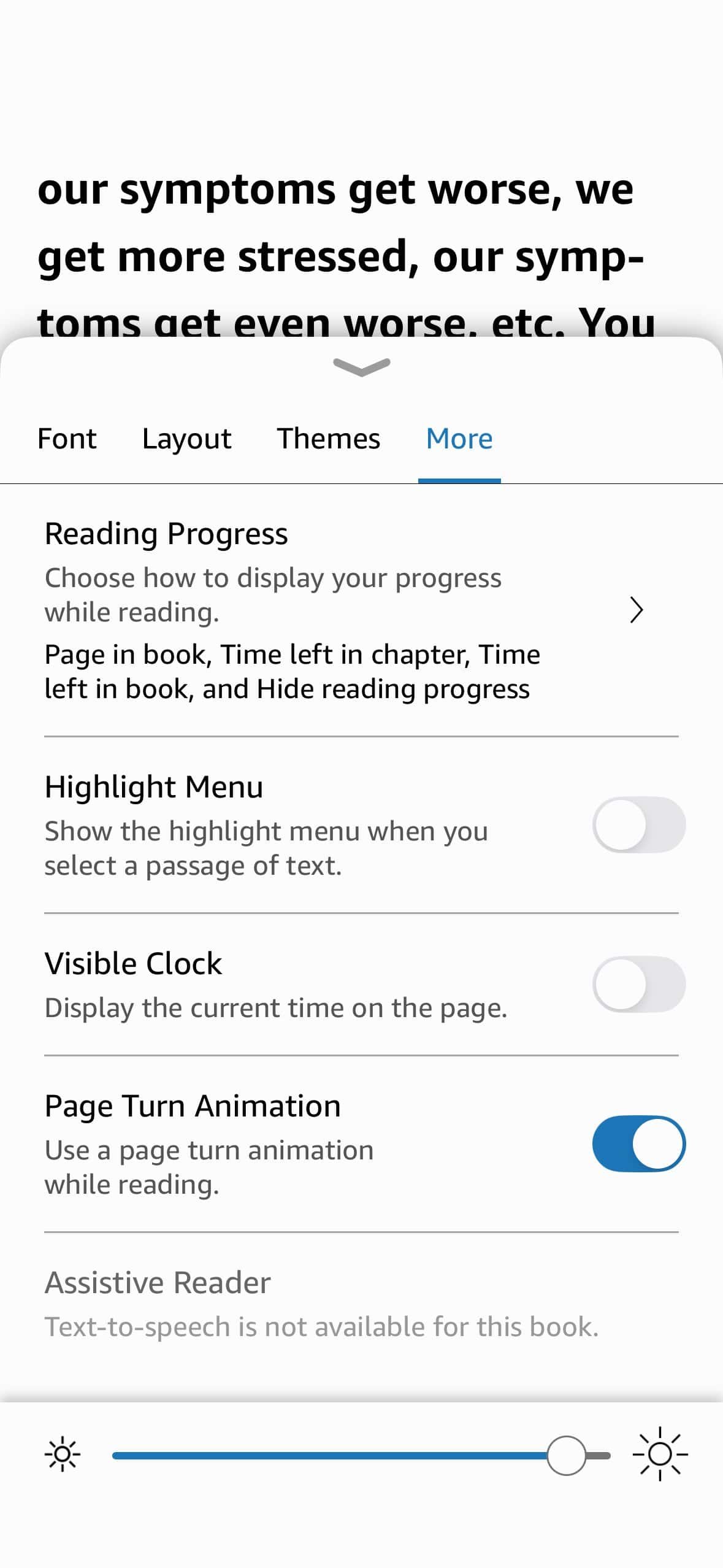
When creating your ebook, it’s always good to consider that the ereader will display your book in the best way for the reader.
-
- iPhone Kindle Reader: Accessibility Font Options
-
- Other Accessibility Options for Kindle Readers
-
- Layout Options in Kindle
-

- Accessibility Options in Kindle

-

- Low Vision Text in Kindle
2. Alt Text That Actually Helps
Screen reader users rely on text descriptions to understand images, charts, and other visual elements. Adding alternative text (alt text) to these elements is essential for accessibility.
When writing alt text, focus on conveying the purpose and content of the image rather than describing every visual detail. For example, instead of “A blue chart showing increasing values from left to right,” try “Sales growth chart showing 25% increase from Q1 to Q4 2024.” The second description conveys the meaning behind the image, which is more useful to someone who cannot see it.
For informational images (charts, diagrams, screenshots): Describe what the reader needs to know. If you’ve got a chart showing “Pinterest engagement drops 40% after 3 PM,” say that. Don’t just write “chart showing data.”
For decorative images (flourishes, chapter breaks, purely visual elements): Mark them as decorative. Screen readers will skip right over them, which is exactly what you want.
Word’s auto-generated alt text? Delete it. I’m serious. It usually sounds robotic and unhelpful. Your readers deserve better.
Complex Graphics
For complex charts or diagrams, you may need to provide more detailed descriptions:
- Add brief alt text that summarizes the image’s purpose
- In the document text, include a more comprehensive description of what the image shows
- For data charts, consider including the data in table format as well, which is more accessible to screen readers
All text boxes and other objects must be “inline with text” for proper screen reader access. As noted by Techstructional, “All text boxes, images, and objects must be inline with text. This ensures screen readers know the order in which the content needs to be read.”
To set an object as inline with text:
- Right-click the object
- Select “Wrap Text”
- Choose “In Line with Text”
Techstructional also suggests using captions (not shown in my video, but still important!)
- Step 1: Right-click on your image or object.
- Step 2: Click Insert Caption
- Step 3: Type in a descriptive caption no longer than 250 characters.
3. Color Choices That Work for Everyone
This one’s often overlooked: if you’re using colors for your headings or emphasis, make sure they have enough contrast. Light gray text on white backgrounds might look elegant, but they’re murder for people with low vision.
A good rule of thumb: if you’re squinting to read it on your screen, it’s probably not accessible. Word will also give you other options for colors, so be sure to run the checker in the next section.
4. Table of Contents Set Up & Maintenance
A table of contents (TOC) is critical for navigation in longer documents. Word can automatically create one based on your heading styles:
- Position your cursor where you want the TOC to appear (typically after the title page)
- Go to the “References” tab
- Click “Table of Contents” and select your preferred style
- Word will generate a TOC based on your headings
The beauty of this approach is that your TOC will be interactive—readers can click on entries to jump to specific sections. Additionally, if you update your document, you can refresh the TOC by right-clicking it and selecting “Update Field.”
For e-readers, bookmarks provide another navigation aid:
- Select the text you want to bookmark
- Go to the “Insert” tab
- Click “Bookmark”
- Give your bookmark a descriptive name (without spaces)
- Click “Add”
These bookmarks can be linked to from elsewhere in your document, creating an interactive experience similar to a website.
The Built-in Accessibility Checker
Word has a pretty decent accessibility checker built right in. Go to Review → Check Accessibility, and it’ll flag potential issues. Don’t ignore this step—it catches things you might miss.
The checker will highlight:
- Images missing alt text
- Poor color contrast
- Heading structure problems
- Tables without proper headers
Fix everything it flags before moving on to conversion. Save your document as a DOCX file.
Problems to Watch Out for When Formatting
Even with good intentions, it’s easy to create accessibility barriers. Here are common issues to avoid.
Using manual formatting instead of styles is a major problem. When you manually bold text to create a heading, screen readers can’t identify it as a heading. Always use Word’s built-in heading styles.
Floating text boxes create problems for screen readers, which often read them out of order or skip them entirely. Avoid using text boxes or ensure they’re properly tagged for accessibility.
“When large expanses of text are formatted to be bold or italics, it can be difficult for some users, like people with dyslexia or low vision, to read. So when character formatting is used, it should be applied sparingly.”
Other common problems include:
- Inconsistent heading levels (skipping from H1 to H3)
- Images without alternative text
- Using tables for layout rather than data
- Low contrast between text and background
- Justified text, which creates uneven spacing
- Overuse of ALL CAPS, which is harder to read
What’s Next?
Getting your Word document accessible is just the first step. In my next video (part 2 of this series), I’ll show you how to convert your squeaky-clean Word doc into an EPUB using Calibre, and then in part 3, we’ll test everything to make sure it actually works the way it should.
It’s important to note that just because Amazon says your book is accessible doesn’t mean it really is. We’ll make sure you’re doing this right.
Final Thoughts
I create ebooks and like designing them, but I realize this might seem like extra work when you just want to get your book out there. But if you read a lot of ebooks, you’ll notice something interesting. Most of them suck. That’s why I wanted to write this post and go through these steps. Readers deserve better.
Not only that, but accessibility features benefit everyone, and they’re becoming mandatory anyway. Better to get ahead of the curve than scramble to fix everything later.
Accessible books are just better books. They’re easier to navigate, more professional, and they work better across different devices and platforms. Your readers will thank you, even if they don’t know why.
Ready to make your ebooks accessible? Start with these Word document basics, and you’ll be well on your way to reaching every reader who wants to enjoy your work.
TLDR
Only 37.4% of publishers currently produce accessible ebooks, despite upcoming requirements in the European Accessibility Act. Your attention to these elements puts you ahead of many publishers and authors.
- Create a comprehensive table of contents that links to all major sections
- Use consistent font styles throughout the document
- Provide alternative text for all images and visual elements
- Ensure sufficient color contrast (use the accessibility checker)
- Use built-in formatting tools rather than manual formatting
- Create meaningful hyperlinks with descriptive text
- Add document tags and metadata for improved navigation
Further Reading
- Adobe: The complete PDF Accessibility List
- Techstructional – 12 Ways to Make Microsoft Word Documents Accessible
- Techstructional – Word Document Accessibility Checklist
Want to see the complete process in action? Check out the video above for a step-by-step walkthrough of everything covered in this post. And don’t forget to subscribe for parts 2 and 3 of this accessibility series!
Tell the Trees is supported by its readers. When you make a purchase using links on this site, it may result in affiliate commission. Please visit my affiliate disclosure page for more information.
Let's Discuss It

After my post about the European Accessibility Act, I got some fantastic questions from you that made me realize we need to have a more practical conversation especially regarding digital products. My original post focused on what’s been published — either written by lawyers for lawyers or aimed at big publishers with compliance departments. But what

One of the most often missed topics when it comes to writing and your office workspace is productivity. As a writer, you are focused on drafting, editing, book covers, ARC Reviews, and other important self-publishing topics, we forget that there are more efficient ways to do things. In your office or writing space, you might

The biggest threat for authors on Substack isn't competition or algorithm changes. It's something far more basic: the platform itself. Let's learn more.

As authors, we put our hearts on the page and then send our work out into the world, hoping it resonates with readers. But let’s be real—not everyone is going to love what we create, and some people are going to be downright nasty about it. If you’ve ever published a book, shared your writing